CS Rebrand
At Childrensalon, I work closely with product managers, engineers and design stakeholders to define the visual direction of the brand on the website and on socials. My role spans both strategic decision making and hands-on design, contributing to the evolution of design system and interface standards across the product.

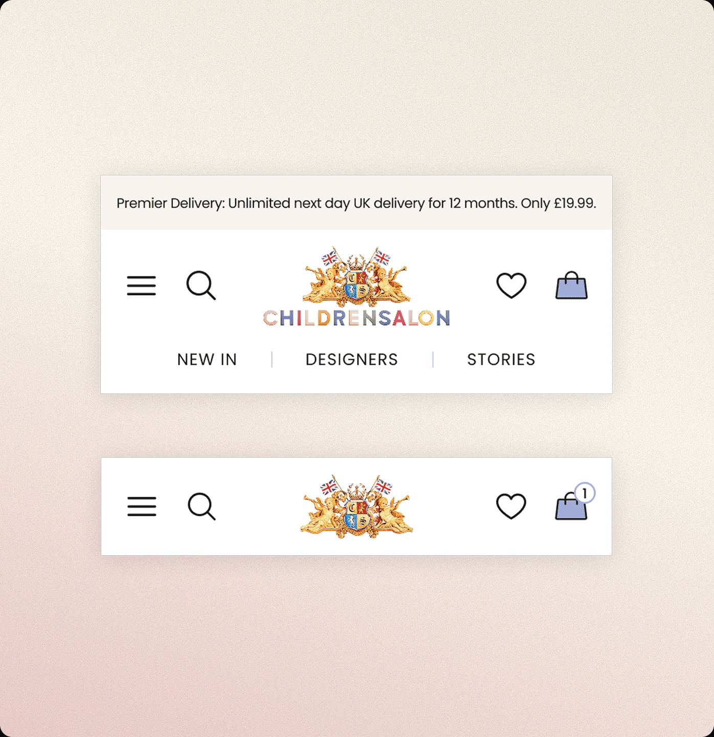
With this rebrand, we aimed to make key touch points cleaner and easier to interact with.
The existing UI featured detailed iconography that reflected the character of the brand, but as the product evolved there was an opportunity to create greater clarity and consistency across the experience. Alongside this, we explored how the visual identity could adapt more effectively to digital environments through a refreshed colour palette. This led to the introduction of Periwinkle as a new primary brand colour, supported by a darker, more functional shade that guides users towards key actions and CTAs. The updated palette also informed the evolution of the brand’s social presence, creating a more cohesive and recognisable identity across both product and marketing touch points. To support this further, we simplified the iconography to feel lighter and more intuitive, while refining the navigation to feel more structured.

Scaling the Design System
Behind the scenes, my focus was on creating a system that could scale. I developed a style guide built on reusable components, tokens and variables, making it easier to maintain consistency as the product evolved. I mentored junior designers in adopting the system while improving workflows and design approaches across wider teams.


